
How to use the Open Aquarium Project’s name, logo, and “Works with Open Aquarium” badge.
These guidelines are for contributors, writers, community sites, and equipment makers. The files they describe are in this folder, and the README lists them.
Status: draft, October 2026. The badge is not in use yet. Until the compatibility program’s policy is published, don’t put the badge, the logo, or the mark on products or packaging. See Section 9.
1 The Mark

The mark is an open glass tank holding water, drawn in isometric view. It stands for any aquarium, from a bowl to a public exhibit, and not for one kind of fish or system. Its cube shape stands for a module that fits into a larger system. The open top stands for openness: equipment and data that are not sealed inside one maker’s ecosystem.
The mark keeps its shape in one color, so it can be printed, silkscreened, laser marked, or molded into a housing. On equipment, it tells owners that the product works with Open Aquarium specifications.
2 Versions
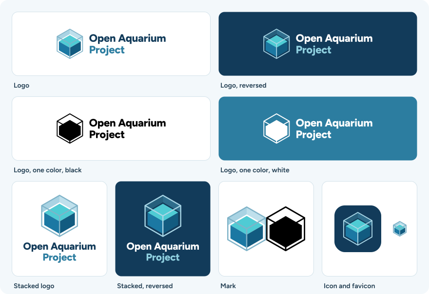
| Version | Use |
|---|---|
| Logo | Most uses: the mark with the project’s name beside it. |
| One-line logo | Wide, short spaces, such as website headers and footers: the mark with the name beside it on one line. |
| Stacked logo | Square or narrow spaces, such as stickers and banners. |
| Mark | Where the project’s name appears nearby, such as a website header, and on products (see Section 9). |
| Icon | Avatars, app icons, and social media profiles. |
| Favicon | Browser tabs, and anything else from 16 to 24 pixels. |
The logo and the mark each come in four versions: full color, reversed for dark backgrounds, one color in black, and one color in white. The one-line logo and the stacked logo each come in full color and reversed. The one-line logo is built from the logo’s outlines: the name is set 1.25 times as large, on one baseline with a word space before “Project”, and its capitals are centered on the mark’s height. Figure 1 does not show it yet.
3 Backgrounds
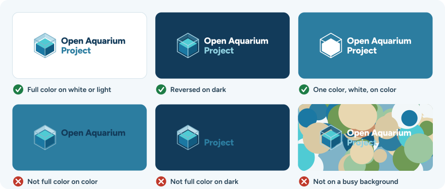
- Use the full-color version on white and very light backgrounds.
- Use the reversed version on Deep Water and other dark backgrounds.
- Use the one-color white version on mid-tone colors, such as Current, and on photographs.
- Use the one-color black version on light colors other than white, and when printing in one ink.
- On a photograph, place the logo over a calm, even area, or on a solid panel.
If you aren’t sure, ask whether black or white text would be easier to read on the background. Where black would, use the full-color or black version; where white would, use the reversed or white version. The full-color logo fails on mid-tone colors because Deep Water has a contrast of only 2.5:1 with Current.
4 Clear Space
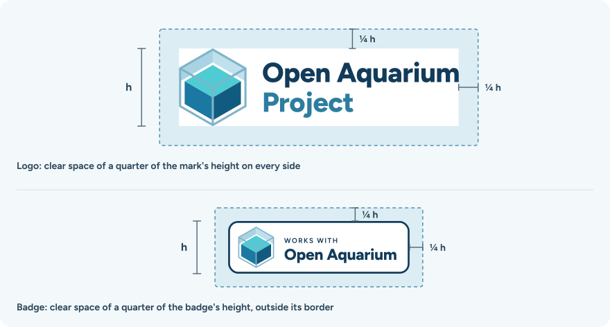
- Leave clear space on every side of the logo of at least one quarter of the mark’s height.
- Leave clear space on every side of the badge, outside its border, of at least one quarter of the badge’s height.
- Keep text, images, other logos, and the edge of the page or product out of that space.
5 Minimum Sizes
| Item | On screen | Printed, silkscreened, or laser marked | Molded or embossed |
|---|---|---|---|
| Logo | 140 px wide | 30 mm wide | Use the mark. |
| One-line logo | 200 px wide | 45 mm wide | Use the mark. |
| Stacked logo | 100 px wide | 16 mm wide | Use the mark. |
| Mark | 24 px tall; smaller than that, use the favicon, down to 16 px | 8 mm tall | 14 mm tall |
| Badge | 200 px wide | 40 mm wide | Use the mark. |
| Stacked badge | 140 px wide | 30 mm wide | Use the mark. |
At these sizes, “WORKS WITH” on a printed badge is at least 4.3 points, and the thinnest lines and gaps in the one-color mark are about 0.2 mm when printed and 0.3 mm when molded. Text that small does not hold up in a mold, so mold the mark and print the badge on the packaging. These sizes are provisional until they are checked on printed samples and molded parts.
6 Color
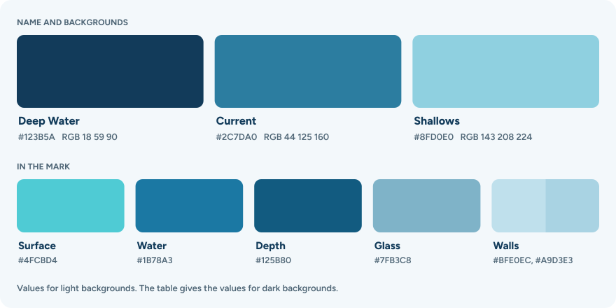
| Name | Hex | RGB | Use |
|---|---|---|---|
| Deep Water | #123B5A |
18, 59, 90 | The name on light backgrounds, and the background for the reversed versions and the icon. Contrast with white is 11.7:1. |
| Current | #2C7DA0 |
44, 125, 160 | “Project” in the name, on light backgrounds. Contrast with white is 4.6:1. |
| Shallows | #8FD0E0 |
143, 208, 224 | “Project” in the name, on dark backgrounds. Contrast with Deep Water is 6.8:1. |
| Name | On light backgrounds | On dark backgrounds | Part of the mark |
|---|---|---|---|
| Surface | #4FCBD4 (79, 203, 212) |
#4FCBD4 |
The surface of the water. Not for text. |
| Water | #1B78A3 (27, 120, 163) |
#1B78A3 |
The front of the water. |
| Depth | #125B80 (18, 91, 128) |
#125B80 |
The side of the water. |
| Glass | #7FB3C8 (127, 179, 200) |
#A9D6E6 (169, 214, 230) |
The edges of the tank. |
| Walls | #BFE0EC (191, 224, 236) and #A9D3E3 (169, 211, 227) |
#2F6D8C (47, 109, 140) and #265F7C (38, 95, 124) |
The inside walls of the tank, above the water. |
The files use flat colors, with no transparency or gradients. Print colors, such as spot colors and CMYK values, have not been chosen. Until they are, print the full-color versions from the RGB values and check a proof, or use a one-color version.
7 Typeface
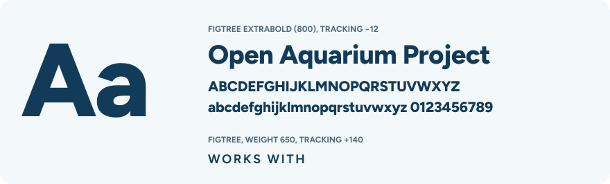
The name in the logo is set in Figtree ExtraBold (weight 800), with tracking of −12/1000 em. “WORKS WITH” on the badge is set in Figtree at weight 650, with tracking of +140/1000 em. Figtree is free to use under the SIL Open Font License.
The files contain the name as outlines, so they don’t need the font installed. Don’t retype the name to make a logo; use the files.
For headings in the project’s own materials, such as its website, slides, and posters, use Figtree at weight 700 or 800. Body text can use Figtree or the reader’s system font.
8 Writing the Name
- The project’s name is Open Aquarium Project. Write it in full the first time it appears in a document; after that, “the project” is enough.
- Specifications are named “Open Aquarium” followed by their title, such as “Open Aquarium Module Bus”.
- Write “Open Aquarium” as two words, capitalized as shown. Don’t abbreviate it to “OAP” or “OA”.
- Don’t use “Open Aquarium” in the name of a product, company, app, or domain.
- Describe what a product does in plain words, and name the specifications and revisions it implements, for example: “Implements the Open Aquarium Module Bus specification, revision 0.1.”
- Don’t describe a product as certified, approved, or endorsed by the project. The project does not certify products.
9 Works with Open Aquarium

The “Works with Open Aquarium” badge tells owners that a product works with Open Aquarium specifications. It is the project’s compatibility mark.
9.1 Status
The project’s governance says that a compatibility program will require conformance testing, and that its policy will be published before the mark is used. That policy has not been written yet. Until it is published:
- don’t put the badge, the logo, or the mark on products, on packaging, or in product listings; and
- describe compatibility in plain words instead, as in Section 8.
On a product, the mark alone makes the same claim as the badge, so this applies to every version.
9.2 Using the Badge
These rules apply to products that the compatibility program’s policy allows to carry the badge.
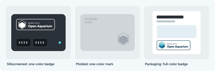
- Use the badge on packaging, websites, manuals, and product listings: the full-color badge on light backgrounds, the reversed badge on dark backgrounds, and the stacked badge in square spaces.
- On a housing, use a one-color badge where it fits at the sizes in Table 2.
- Where the badge doesn’t fit, or where the housing is molded or embossed, use the one-color mark, and put the badge on the packaging and in the manual.
- List the specifications and revisions the product implements in its manual or on its website.
- Use the badge files as they are. Don’t change the words, and don’t make your own badge.
- Next to other compatibility marks, give each mark its own clear space, and don’t merge them.
10 Misuse
Use the files as they are. These are examples of changes that make the logo and the badge harder to recognize, or that make a claim the project hasn’t made.
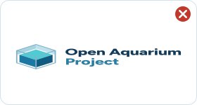 Don't stretch or squash it. |
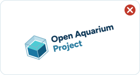 Don't rotate it. |
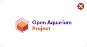 Don't change its colors. |
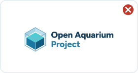 Don't add shadows, glows, or other effects. |
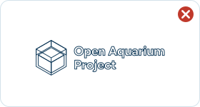 Don't outline it. |
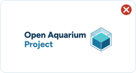 Don't rearrange the mark and the name. |
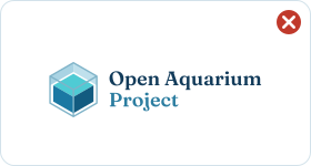 Don't set the name in another typeface. |
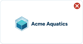 Don't use the mark with another name, or in your own logo. |
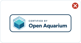 Don't change the badge's words. |
Also don’t crop the mark, place it on a busy background (see Figure 2), or use parts of it on their own.
11 Construction
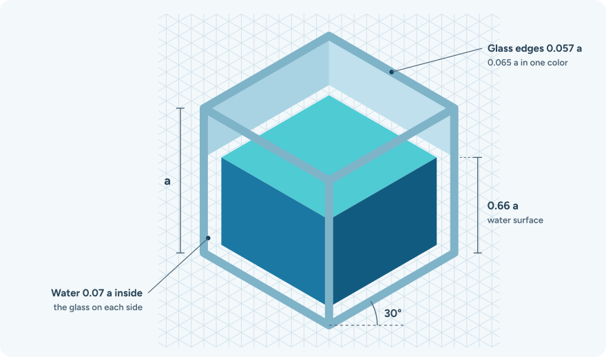
Always start from the SVG files. These measurements are for checking a mark that had to be redrawn, for example in CAD for a mold.
- The mark is a cube with edge length a, drawn in isometric projection, so its horizontal edges rise at 30°.
- The tank is open on top.
- The water fills the tank to 0.66 a above the base.
- The water is set 0.07 a inside the glass on each side, and 0.056 a above the bottom.
- The glass edges are 0.057 a wide, with round joins and ends.
- In the one-color versions, the glass edges are 0.065 a wide. A gap of 0.051 a separates the surface of the water from its front and side, and a gap of 0.045 a separates the front from the side.
- In the favicon, the glass edges are 0.125 a wide, so that they survive at 16 pixels.
12 Open Questions
- License for these files. Licenses does not cover this folder yet.
- Compatibility program. Which products may carry the badge, which conformance tests they must pass, and how results are checked.
- Trademarks. The results of a trademark search on the name, and whether to register the name and the mark.
- Print colors. Spot colors and CMYK values for the palette.
- Minimum sizes. The sizes in Table 2, checked on printed samples and molded parts.